A tiny bit of typography
As part of “The story so far” I learned just enough HTML and CSS to know how to lay out text, images and other things on a page. This lets me change the default styling of Times New Roman text with close-together lines that run right up to the edge of the browser window into anything else I like. But I struggled a little with finding something I did like!
Changing fonts, spacing and other things still left me feeling pages looked like walls of text or distractingly spaced out. Similar amounts of content on my main neil-vass.com blog or other sites look much more readable and inviting. This is a topic I’d like to get better at in general: how can I know what’ll look good, or what tweaks to try when I’m not happy with something? Since most of the content right now is text, that means learning a little typography. I know this is a huge topic so I don’t expect to get expert in it, but since I’m starting from pretty much zero knowledge a little learning will make a big difference.
Here’s a few highlights from the things I looked into, maybe someone else will find them useful too?
A few online books
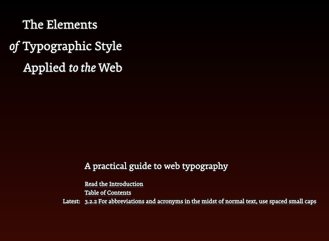
I see Robert Bringhurst’s The Elements of Typographic Style get mentioned again and again as an important reference for typography, and I’ve learned a lot from an online adaptation of it: The Elements of Typographic Style, Applied to the Web by Richard Rutter quotes lots of the principles from that book, and explores how they can be translated to CSS.
I love the way some of the principles are phrased, with warnings such as “However common it may be, the use of titling figures in running text is illiterate: it spurns the truth of letters” (3.2.1), and “A man who would letterspace lower case would steal sheep, Frederic Goudy liked to say” (2.1.7).
There’s also plenty of interesting background on what some terms mean, and what options you have for working with these in CSS:
- “Ems are so-called because they are thought to approximate the size of an uppercase letter M (and so are pronounced emm), although 1 em is actually significantly larger than this.” (2.1.1). This sent me down a Wikipedia rabbit hole.
- Discussing kerning — adjusting the spacing between specific letter pairs — it notes that “digital fonts have kerning tables built-in. These tables define which letter pairs need adjusting and by how much” (2.1.8). I had no idea!
- “Leading (pronounced ‘ledding’) is so called because, in mechanical presses, strips of lead are placed between lines of type to space the lines apart.” (2.2.1).
Another book I enjoyed: Butterick’s Practical Typography, starting with its “Typography in ten minutes” guide and then diving into lots more topics, from big-picture things like who typography is for to very specific details on things like how to set line spacing (including a link to the author’s incredibly detailed Stack Overflow answer on why you should use no units for line-height in CSS).
I got lots more understanding about what makes page layout easy or harder to read, and got much happier with this site’s layout after playing around with some ideas from it. In other places, I’m intrigued by very strong opinions on things I can initially barely spot the difference between — for example, the author says “I dislike Arial more than Comic Sans. Though it’s the undisputed king of the goofy fonts, Comic Sans is at least honest about what it is. But Arial is merely a bland, zero-calorie Helvetica substitute.”

This online book is an interesting experiment in the economics of the web: it’s open publicly, but asks that you pay for it, and makes a compelling case for why you should and wrote about the financial results for the first few years. I’ve paid for it — I agree with lots of his points, and would like to see this kind of idea succeed.
Some things to watch
After reading lots of strong opinions about font choices, when I found out there’s a movie about Helvetica I just had to watch it.
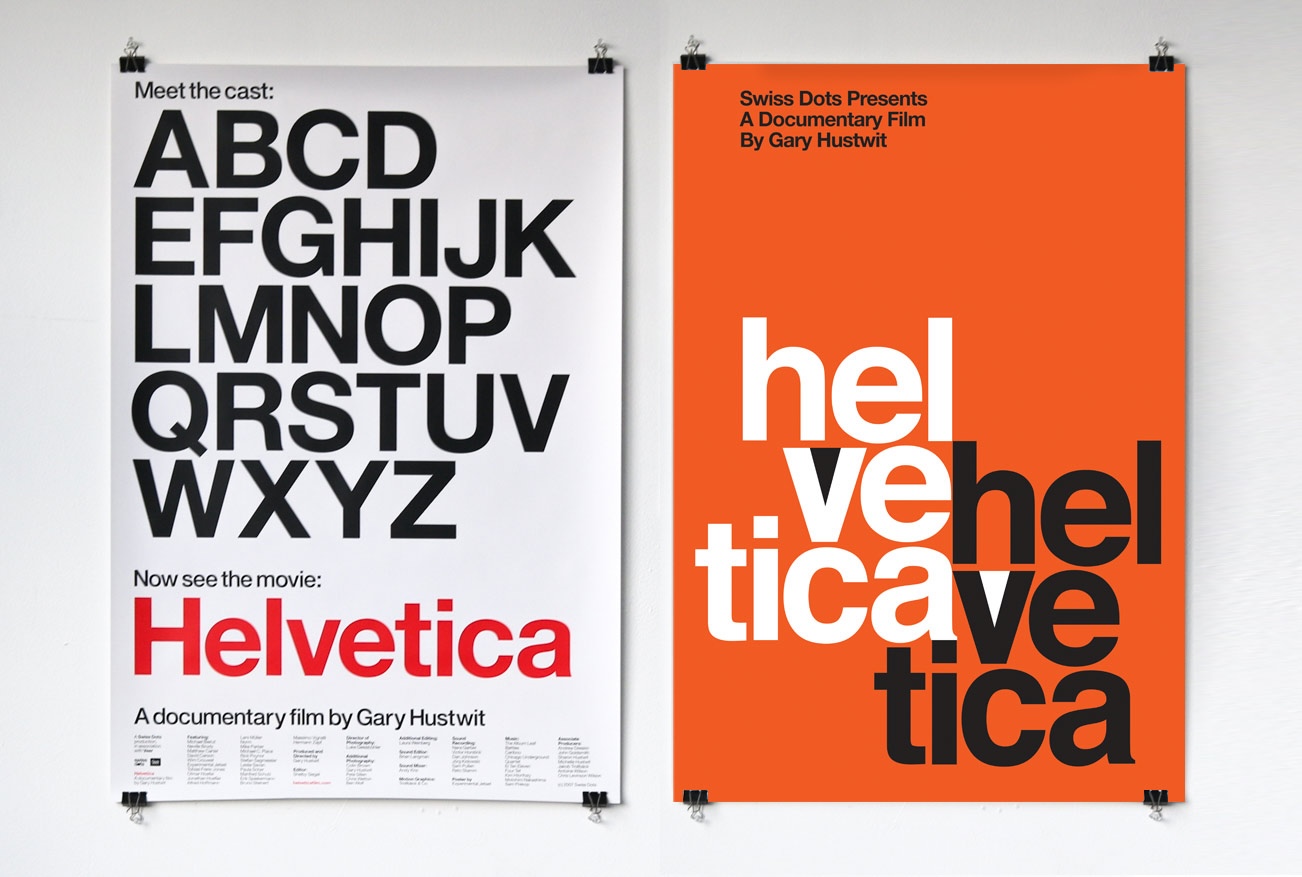
This was a fascinating look at how ubiquitous this font is — once you start looking out for it, it’s everywhere! — and at how all kinds of designers feel about this and other typefaces. A world I had no idea about.
For shorter videos that I really laughed at, you might like Elle Cordova’s “Fonts hanging out” and “Punctuation marks hanging out”.
And for some wider ideas about what’s possible with laying out web pages — especially useful once I get past this “just the article” stage and on to navigation, sidebars, and other complications — I found the Jen Simmons talk “Everything You Know About Web Design Just Changed” very helpful. It’s from 2019 but I feel all caught up on the 30-ish years of web layout history up to that point, and a much better sense of what my options are with the dizzying range of CSS features I’ve been learning about. Jen has a lot of great talks linked from her site.

So, did it help?
I started off with no styling at all, just what the browser gives you — and through reading, watching, and trying things out I’ve changed it into the site you’re looking at now. Want to see the difference?
Butterick’s Practical Typography in particular helped me understand what was making my paragraphs still look like walls of text or weirdly spaced out and got me to this setup I’m very happy with. I haven’t implemented all of that book’s advice — the author would still say my headings are too big, and be disappointed I haven’t gone and found a professional font to purchase for the site — I’ll keep playing and maybe come back to these.
Another piece of advice I have, if you’d like to learn about making a site look good on a range of screen sizes: accidentally leave out the viewport meta tag, see your page looks rubbish on your phone, spend an hour reading docs and finding nothing works like you expect … then realize. I now have a nice page and a lot more knowledge of px, em, rem, ch, %, vw, fr, and more.
The next user-facing step will be to add more page elements around these blog posts, but first I’m going to look into something else. Writing bare HTML hasn’t been an enormous overhead so far, but it is getting a bit repetitive. And once there’s more boilerplate like navigation that’s the same on every page, it’ll be very annoying to add and keep updating everywhere as it evolves. Next time: some kind of templating system so I can make post writing be more about just the post content.